
 678-666-0628

10 Dec Essential Mobile Website Design Tips for Kitchen & Bath E-commerce
Essential Mobile Website Design Tips for Kitchen & Bath E-commerce
Your customers are more connected than ever. They explore and make decisions from their smartphones and tablets. A poor mobile checkout experience drives e-commerce customers away. At Kitchen365, we know a strong mobile experience can revolutionize your business. Use these mobile website design tips to ensure your site thrives on mobile devices.
Mobile optimization is critical. Poor usability and performance are directly driving down customer retention. Focus on:
- Speed
- Flexible design
- Simple navigation & UX
- Mobile-optimized product pages
- Streamlined checkout
- Visual search & AR
- Continuous improvement
Every Millisecond Counts
A slow-loading site is the fastest way to send mobile shoppers packing. Mobile users expect webpages to load in 3 seconds or less. Quick-loading pages can improve organic traffic by 25%. Bounce rates for slower pages reach 53%.
Achieve Lightning-Fast Load Times
To deliver speed, focus on:
- Optimize Images: High-quality kitchen and bath images are essential, but they must be compressed. Optimize them for speed without sacrificing noticeable visual quality.
- Leverage Caching: Store frequently accessed data on the user's device or an intermediate server. This reduces server response times for repeat visits.
- Minimize Code: Clean up unnecessary scripts and CSS to reduce load time. Optimize code files for smaller size and faster parsing.
Responsive Design is A Mandatory Standard
Your website must adapt effortlessly to any screen size.
The Foundations of True Adaptability
Make sure your design is responsive by enforcing:
- Fluid Grids: Ensure your layouts adjust dynamically.
- Flexible Media: Images should scale up or down gracefully.
- Media Queries: Use CSS to apply different styles based on screen characteristics.
Simplify Navigation & UX
Since mobile screens offer limited room, design your navigation to be simple, concise, and effortlessly reachable with a thumb.
Putting Controls Within Reach
To amplify mobile user experience:.
- Hamburger menus
- Large, touch-friendly buttons
- Intuitive product categorization
- Clear CTAs
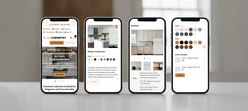
Optimize Product Pages for Mobile Browsing
The success of your store hinges on the product page. Ensure they convert effectively on small screens.
Mobile-First Strategies for Product Page Optimization
Concentrate on clarity and detail:
- High-Quality Images with Zoom: Let customers truly see the details of that stunning quartz countertop or intricate faucet.
- Concise Descriptions: Get straight to the point with key features and benefits. Use bullet points for readability.
- Prominent Pricing & Availability: No one wants to hunt for this information.
- Easy Customization Options: If you offer various finishes, sizes, or configurations, make these selections simple to navigate.
Streamline the Checkout Process.
Many mobile sales are lost here. A complicated, multi-step checkout process on a small screen deters customers.
The Path to One-Tap Purchase
Simplify the buying process to boost sales:
- Guest Checkout Option: Don't force users to create an account.
- Auto-fill Forms: Leverage browser autofill for addresses and payment info.
- Progress Indicators: Show users how many steps remain.
- Mobile Payment Options: Integrate with Apple Pay, Google Pay, or other one-tap solutions.
Use Visual Search & Augmented Reality
For kitchen and bath products, seeing is believing. Over 40% of online shoppers use visual search at least once a year in their purchase journey. Product pages with AR see 94% higher engagement than those with static images.
Making the Most of Immersive Visuals
Embrace next-generation tools:
- Visual Search: Allow users to upload a photo of a style they like and find similar products on your site.
- Augmented Reality: Let customers "place" a vanity in their bathroom or a faucet on their countertop using their phone's camera. This is a game-changer for reducing buyer's remorse and increasing confidence.
Test, Analyze, and Iterate
Mobile website design isn't a "set it and forget it" task. Sites that run A/B testing regularly see conversion rates up to 50% higher. The more frequent the testing, the better.
The Continuous Improvement Loop
- Regularly Test: Use tools like Google's Mobile-Friendly Test and conduct user testing on various devices.
- Monitor Analytics: Pay attention to mobile bounce rates, conversion rates, and time on site.
- Gather Feedback: Listen to what your customers are saying about their mobile experience.
Don't Let Mobile Sales Slip Away
Your site has the potential to reach more customers and increase revenue through mobile. By using these tips, you can further your mobile conversion rates.
Ready to revamp your mobile presence and stop losing sales? Contact Kitchen365 today for a comprehensive review of your e-commerce site and discover how we can help you create an exceptional mobile shopping experience!
Frequently Asked Questions
Why is mobile optimization crucial for e-commerce sites?
Over 70% of online shopping traffic now comes from mobile devices.
What’s the biggest mistake retailers make with mobile website design?
Many businesses focus on creating a beautiful desktop site and treat mobile as an afterthought. The biggest mistake is failing to test and design specifically for mobile users.
How can I make my product images load faster without compromising quality?
Use image compression tools like TinyPNG format to reduce file sizes while maintaining image clarity.
What does responsive design mean, and do I need it?
Responsive design ensures your website automatically adjusts to any screen size. Without it, mobile users may struggle with distorted layouts or text that’s too small to read.
How can I simplify navigation for mobile users?
Use a hamburger menu to condense your navigation, add large, touch-friendly buttons, and organize products into intuitive categories.
What should I add to my product pages for the best mobile experience?
Highlight key information first, product images, pricing, and availability. Include short, scannable descriptions, zoom-enabled photos, and easy-to-use customization options.


Sorry, the comment form is closed at this time.