

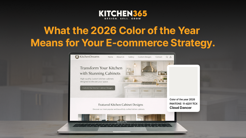
23 Dec What the 2026 Pantone Color of the Year Means for Your E-commerce Strategy
What the 2026 Pantone Color of the Year Means for Your E-commerce Strategy
Each year, professionals across industries eagerly await Pantone’s Color of the Year reveal. The selected hue sets the tone for:
- Product development
- Branding narratives
- Digital experiences
For e-commerce brands, the 2026 Pantone Color of the Year is a strategic opportunity. When leveraged thoughtfully, it can inform:
- Product design
- Magnify visual storytelling
- Drive buying decisions
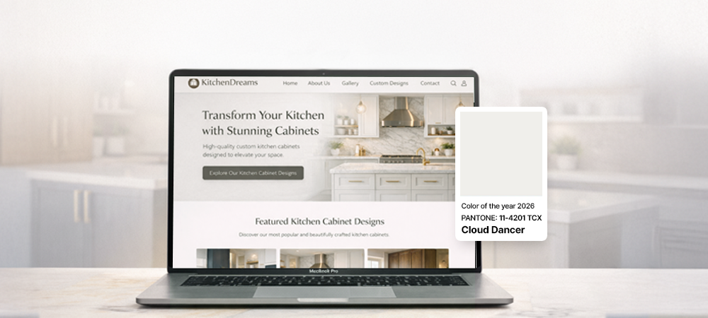
The 2026 Color of The Year
Each December, the Pantone Color Institute announces a shade that encapsulates:
- The cultural mindset
- Shifts in society and consumer behavior
In 2026, the Pantone Color of the Year is Cloud Dancer. It embodies:
- Tranquility
- Clarity
- Gentle mental reset
The color is:
- Soft
- Sophisticated
It allows people to pause and focus in a world full of visual noise. For e-commerce brands, Cloud Dancer is a tool for connecting with your audience:
- Emotionally
- Psychologically
Here’s why:
- Cultural Relevance
- Emotional Connection
Color affects:
- Mood
- Perception
- Decision-making
Adding Cloud Dancer into your product lines, imagery, and website can resonate with consumers seeking:
- Calm
- Clarity
- Balance
Product Merchandising: Move Beyond “Nice to Have”
Adding the Pantone Color of the Year into your merchandising strategy should be:
- Deliberate
- Story-driven
- Aligned with your brand’s ethos
1. Limited Edition Collections
Exclusive product releases:
- Spark excitement
- Create a sense of urgency
Consider offering Cloud Dancer in:
- Kitchen tools
- Cookware and serve ware
- Textiles
Position your brand as a leader in design innovation and add perceived value by marketing limited editions as:
- Trend-forward
- Collectible
- Seasonal
2. Curated Bundles
Bundles encourage higher average order values and improve product discoverability. Using the Color of the Year strategically, you can create collections that feel intentional and cohesive:
- Descriptive Titles
- Complementary Hues
- Occasion-Based Bundles
Bundles also provide an opportunity for storytelling. By showing how multiple products in the same color can transform a space.
3. Lifestyle Imagery
Photos that depict the color in real-life scenarios outperform flat product shots. Add Cloud Dancer into:
- Styled kitchen environments that show the product in action.
- Human elements:
- People using the product
- Interacting with the space
- Enjoying everyday moments.
- Cozy or aspirational scenes that reflect your audience’s tastes and aspirations.
The goal is to convey feelings as much as a color. Cloud Dancer should evoke:
- Serenity
- Balance
Web Design: Integrating the Color with Purpose
Your website is your digital storefront, and color plays a role in:
- UX
- Conversion optimization
Thoughtful integration of Cloud Dancer can:
- Improve visual hierarchy
- Guide users’ attention
- Reinforce your brand’s personality
1. Accent and CTA Highlights
Strategically apply the Color of the Year to key action points on your website:
- Buttons
- Hover States
- Banners and Badges
Accent usage ensures the color furthers UX without overwhelming the overall palette. It’s about directing attention, not creating visual fatigue.
2. Visual Hierarchy
Even if your brand has an established palette, layering in Cloud Dancer can:
- Increase contrast for important elements
- Break up content sections
- Establish focal points for promotional offers
3. Seasonal Homepage Refresh
Updating your homepage with the Color of the Year signals freshness and relevancy:
- Hero Banners
- Themed Navigation
- Seasonal Blocks
These updates are subtle yet effective ways to convey that your brand is:
- Current
- Culturally attuned
4. Social Proof and UGC
Customer photos using Cloud Dancer products reinforce both trust and trend adoption. Encourage buyers to:
- Share images and reviews
- Feature them on your product pages and social media
This not only validates the color trend but also fosters community engagement and authenticity.
Why This Matters for E-commerce Growth
Infusing the 2026 Color of the Year into your strategy can be a powerful way to enhance your e-commerce results. Thoughtful integration of Cloud Dancer:
- Improves Emotional Engagement
- Improves Product Discoverability
- Strengthens Brand Storytelling
- Encourages Conversions Through UX
Major Takeaways
In a competitive e-commerce landscape, where attention is fleeting, color is a subtle but powerful influencer. Position your brand as trend-aware and consumer-focused by adding Cloud Dancer thoughtfully across:
- Products
- Marketing
- Digital experience
The 2026 Color of the Year is a lens through which you can reinterpret your:
- Merchandising
- Digital design
- Brand storytelling
By weaving Cloud Dancer into every touchpoint, you’re shaping the consumer experience and leading your market with:
- Style
- Intention
- Relevance
Connect with Kitchen365 today to brainstorm how you can infuse Cloud Dancer into your E-commerce brand effectively!
Frequently Asked Questions
What is Pantone’s 2026 Color of the Year?
Pantone’s 2026 Color of the Year is Cloud Dancer, a soft, calming hue that reflects tranquility, clarity, and a desire for balance amid modern digital overstimulation.
Why does the Color of the Year matter for e-commerce brands?
For e-commerce brands, it provides a timely way to refresh products, enhance storytelling, and stay culturally relevant without a full rebrand.
How can e-commerce brands use Cloud Dancer in product merchandising?
Brands can integrate Cloud Dancer through limited-edition products, curated bundles, and complementary color pairings.
Is it necessary to redesign my entire website to use the Color of the Year?
No, Cloud Dancer works best as an accent color. Using it for CTAs, banners, hover states, and promotional highlights can improve visual hierarchy and conversions without overwhelming your existing brand palette.
What types of products work best with Cloud Dancer?
Cloud Dancer is especially effective for home, kitchen, and lifestyle products like cookware, serve ware, textiles, small appliances, and décor items.
How does color impact user experience (UX) and conversions?
Strategic color usage helps guide attention, improve readability, and create emotional comfort. It can subtly direct users toward key actions like adding items to cart or exploring featured collections.
Can small or emerging brands benefit from the Color of the Year?
Absolutely, smaller brands can use Cloud Dancer to signal trend awareness, create focused seasonal campaigns, and compete visually with larger retailers.
How can Cloud Dancer improve brand storytelling?
Color acts as a narrative tool. Adding Cloud Dancer across imagery, bundles, and web elements helps communicate values like calm, intentional living, and modern sophistication.
Should Cloud Dancer be used year-round or seasonally?
While it’s ideal for seasonal refreshes and campaigns, Cloud Dancer’s neutral and calming qualities make it versatile enough to extend beyond a single season when paired thoughtfully with other tones.
What is the biggest takeaway for e-commerce brands?
The 2026 Color of the Year is about creating emotional connection, improving UX, and selling a lifestyle.


Sorry, the comment form is closed at this time.